
01 Read fast
Distance
Can you identify the artist, the date, and the action before you have read a word of small type?

The read test
A graphic has to work in more than one moment. It has to read fast, hold up close, survive the crop, and carry across the campaign. This page runs that test on delivered work. Nothing is scored, nothing is graded, and nothing is compared to anyone else. The work is the evaluation.
01 Read fast
Can you identify the artist, the date, and the action before you have read a word of small type?
02 Hold up close
Does the typography, the image treatment, and the texture hold when you get close?


03 Carry across the campaign
Does the direction stay recognizable when the frame changes?
Format shift
A campaign begins with one controlled visual direction, then adapts into the real files and formats a release needs. Move a piece through the frames. Delivered and preview are labeled every time.
The delivered composition at its full proportion.
1122 × 1402 px as delivered
Every piece here was delivered as one file. Frames marked presentation preview show how the delivered composition sits in other placements. They were not delivered and do not imply a result.

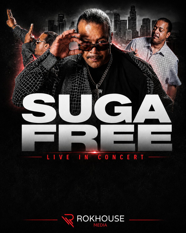
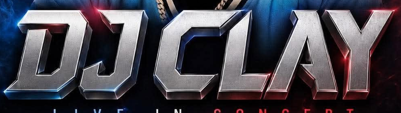
The artist name and the words Live in Concert are the only things that need to survive at thumbnail size, and they do.
The headline carries beveled chrome edges, the red rule is a single thin line, and the skyline is layered behind the portraits at reduced contrast so it never competes with the faces.
Presentation preview. Not a delivered format.
Presentation preview. Not a delivered format.
Presentation preview. Not a delivered format.
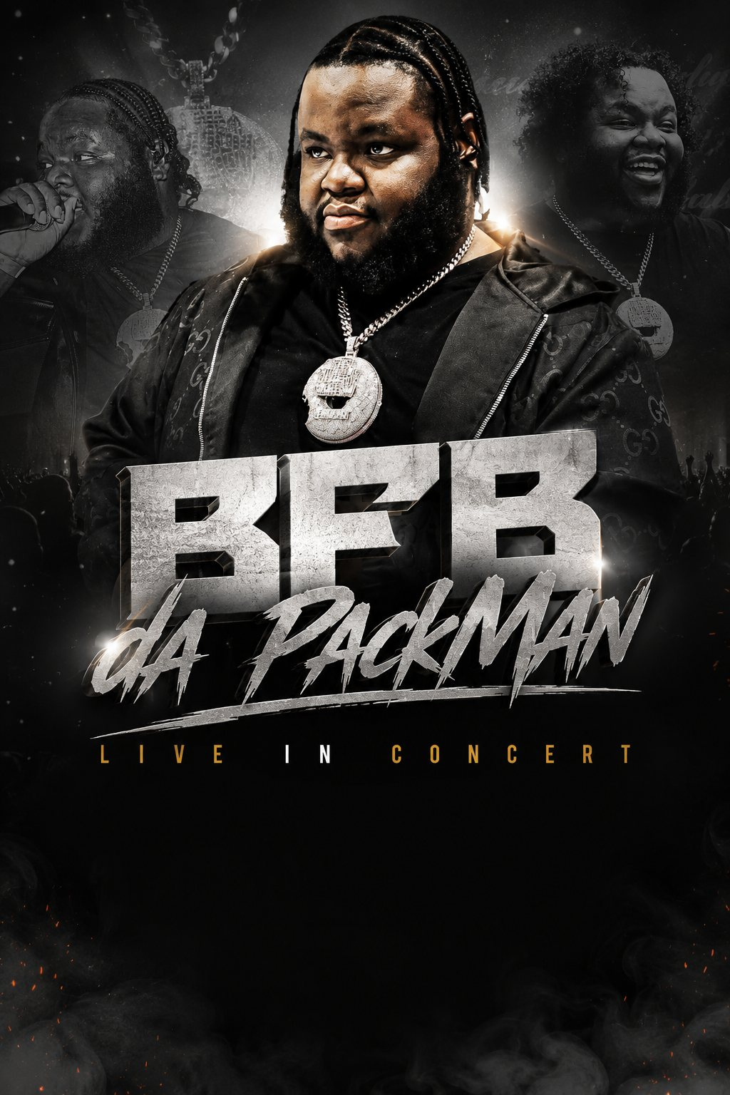
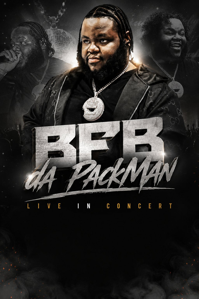
The stone BFB reads first, the script carries the name, and the monochrome palette keeps the portraits legible even when the poster is small.
Two different letterforms are made to sit together through matching texture and a shared light source, and the ember particles are placed only where they will not touch the type.
Presentation preview. Not a delivered format.
Presentation preview. Not a delivered format.
Presentation preview. Not a delivered format.

The two-color split does the identification work before the type does, and the headline stays legible because it is the one neutral element in the frame.
The chrome is built with a cool and a warm reflection on each letter to match the split lighting, and the portraits are cut and layered so the center face carries the energy.
Presentation preview. Not a delivered format.
Presentation preview. Not a delivered format.
Presentation preview. Not a delivered format.
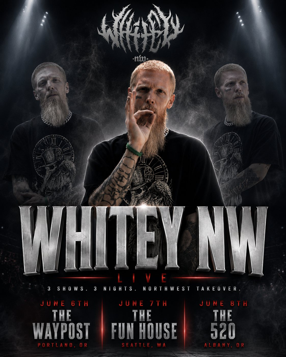
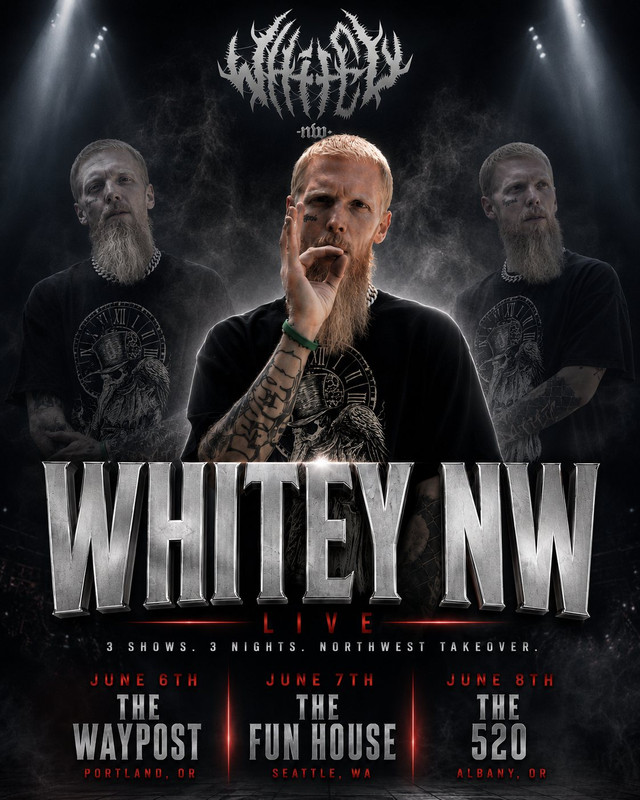
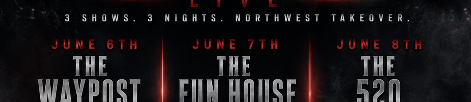
The name and the fact that there are three dates read from across a room. The individual venues are meant to be read up close.
The three-column date block uses the same rule weight and letter spacing as the Live line above it, so the information block belongs to the headline rather than sitting under it.
Presentation preview. Not a delivered format.
Presentation preview. Not a delivered format.
Presentation preview. Not a delivered format.
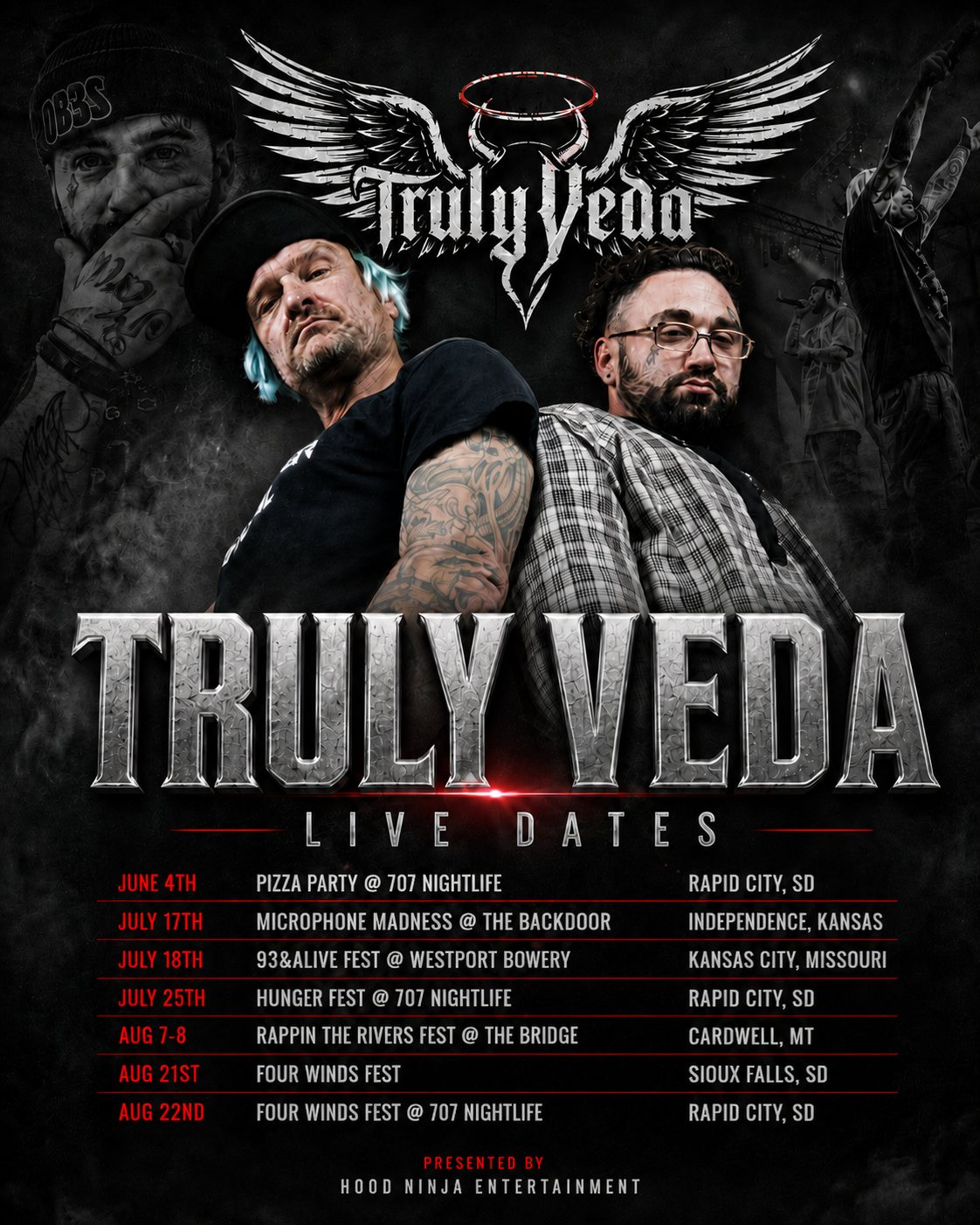
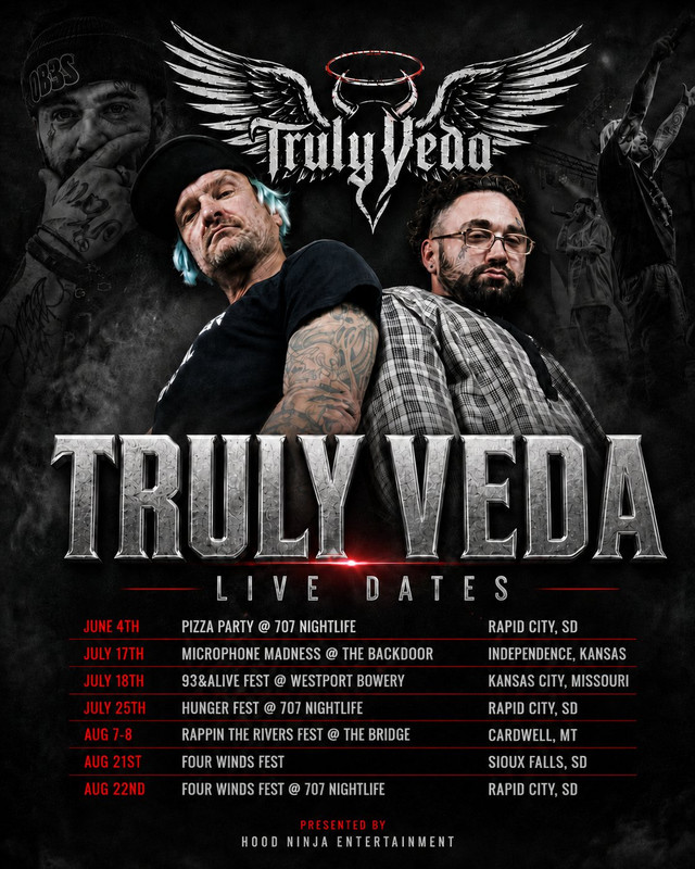
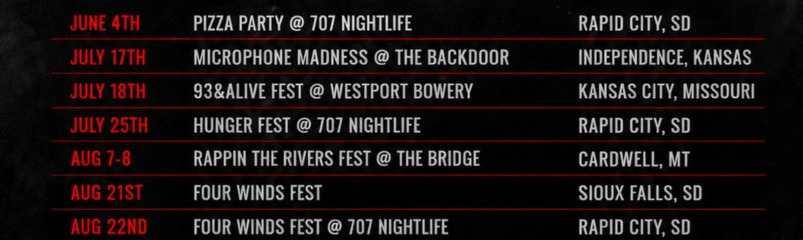
The wings and the name identify the act instantly. The date table is deliberately secondary and is meant to be read once the viewer has stopped.
Seven rows of dates, venues, and cities share one grid, with the date column in red so the eye can scan down it, and every row keeps the same rule weight.
Presentation preview. Not a delivered format.
Presentation preview. Not a delivered format.
Presentation preview. Not a delivered format.
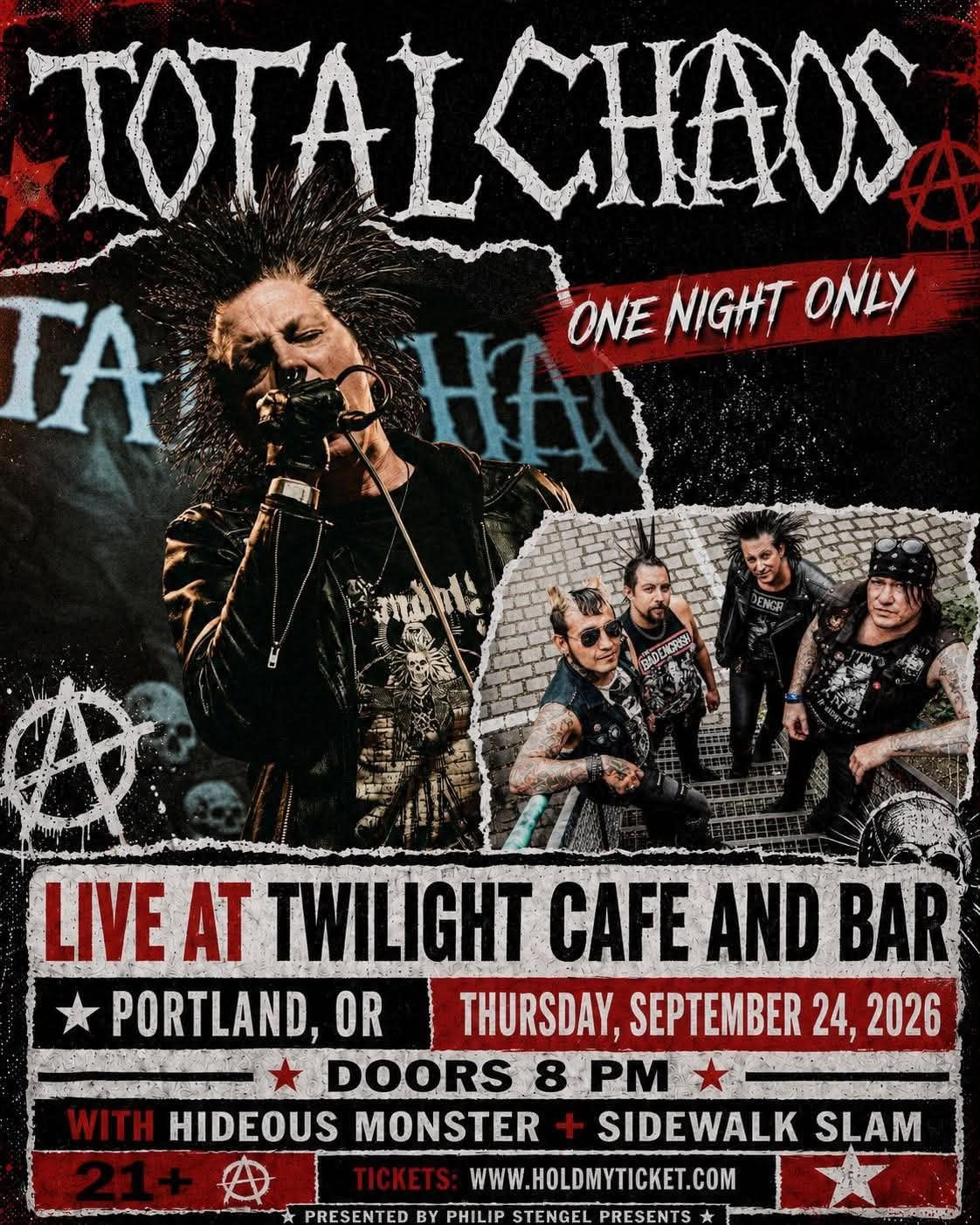
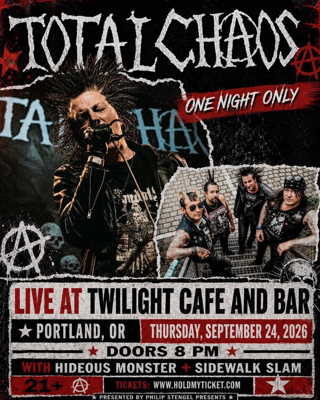
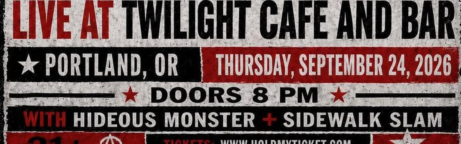
Total Chaos and One Night Only read at any size. The collage texture signals the genre before a single word is read.
The information lives on torn white paper so it stays legible over the collage, and the venue, date, doors, support acts, age, and ticket line are stacked in one consistent block.
Presentation preview. Not a delivered format.
Presentation preview. Not a delivered format.
Presentation preview. Not a delivered format.
Suga Free, Concert Poster
Read fast
The artist, the date, the venue, or the brand has to be identifiable at the size the placement actually gives it. Effects that cost that read are cut.
Hold up close
Type is built, not stretched. Image treatments are made for the composition. Small supporting information keeps the same rule weight as the headline it belongs to.
Carry across the campaign
When a scope includes more than one format, each one is composed for its frame from the same master direction, so the set looks related wherever it lands.
Start a project
Scope, timing, deliverables, and price are confirmed for each project.